Improving users’ understanding of health insurance claims to lower operational costs and increase trust
This case study takes ~15 minutes to read. If you’d like something shorter, use the link below to access presentation decks. Once there, you can choose between 3 versions: 1-slide, 3-slides, and 19-slides.
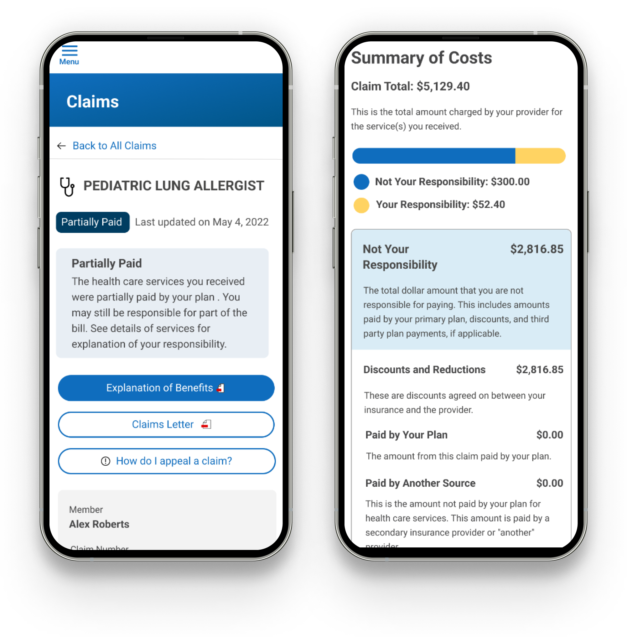
Summary
Major health insurance client sought to lower operational costs. Call-center engagement is one main driver of these costs, and high engagement is caused by confusion among users who are trying to manage their health insurance plans. It was evident that there was an opportunity to remediate this pain point by redesigning the way the company communicates claims information in their online member portal.
Through initiating and leading this large-scale change, we lowered operational costs through a 44% reduction in call-center engagement within targeted user segments.
The Brief
As a consumer, insurance can be very difficult to understand, navigate, utilize, and manage. According to the National Institutes of Health, 51% of Americans report not understanding their health insurance claims. This results in poor consumer outcomes such as high effort, low value, and low quality experience, all at a higher-than-necessary cost to the insurer. There is an opportunity to improve both the effectiveness of the product-service experience while reducing costs to the insurer.
Key Outcomes
We deployed a new claims status system along with claims details explanations. This improved user comprehension of their costs across various touchpoints and decreased call-center volumes and lower operational costs.
Role, Collaboration, and Contribution: Led strategy and design, collaborated with data analyst, UX researcher, content writer, and product team
Background
Health insurance is a legacy industry that affects millions of Americans. One major pain point in health insurance is that users have difficulty deciphering their claims. The challenge in designing solutions to ameliorate this problem lies in creating simple ways to explain complex situations that follow strict business rules. This project illustrates how I leveraged intuition, strategy, and research to solve this pain point given my limited sphere of influence within a large corporation. I will present this case study in 3 parts:
Part 1: Investigating Entropy, Validating My Intuition, and Securing Funding
Part 2: Digging Deeper and Aligning Business Rules
Part 3: Rollout Strategy and Accounting for Edge Cases
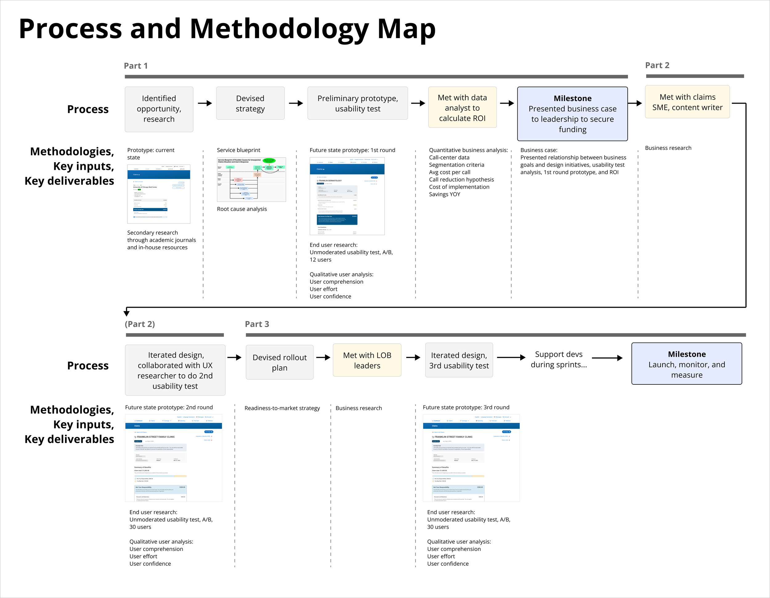
Part 1: Investigating Entropy, Validating My Intuition, and Securing Funding
This project started with a question I posed to a senior designer while going through a claim on the health insurance portal:
“This claim is confusing. Why are we using these specific claim statuses?”
They replied, “I think it was just ported over from our old platform years ago. Not sure if any effort has gone into investigating this.”
Our current claims status system had 3 states:
Paid: The health care services you received were covered by your health care benefits plan and the claim has been paid
Not Paid: The health care services you received were not covered by your health care benefits plan.
Processed: The health care services you received were covered by your health care benefits but no payment was required.
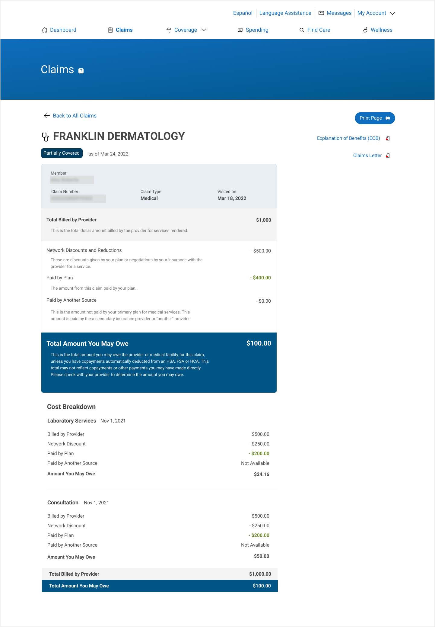
This was the page that explained the claim details:
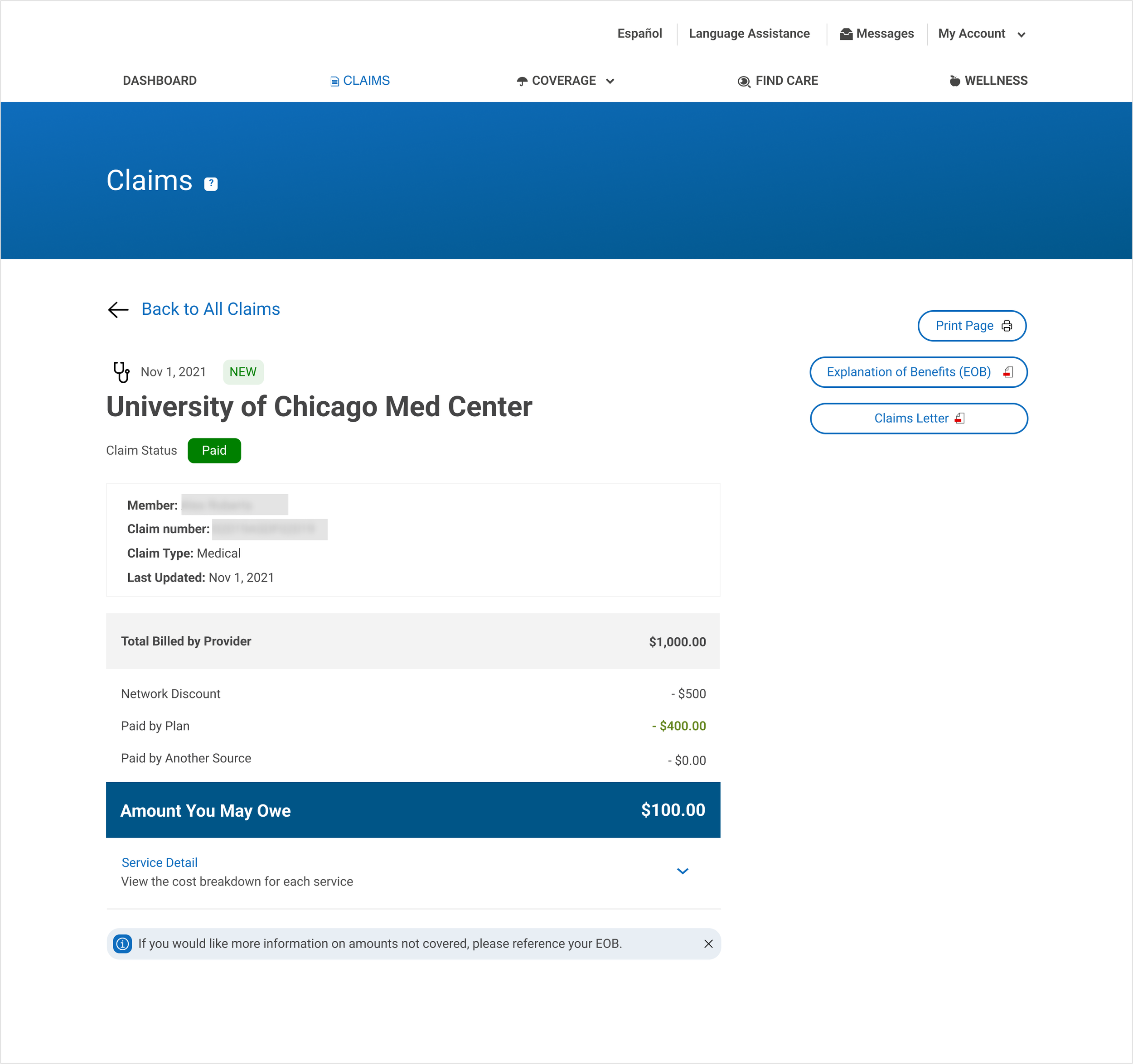
Aside from the statuses being confusing, the claim details page did little to educate the member on their financial situation. Claims status definitions were hidden under a tool tip in the banner, and jargon words were not explained.
I was sure this wasn’t an unexplored problem, so I found a 2019 study indicating that 51% of Americans self-report poor health insurance literacy. I also consulted with the in-house Explanation of Benefits team, who had conducted their own research and had similar findings.
User Problem: Health insurance plans are confusing, and 51% of Americans don’t understand it. They can’t interpret their claims and do not have clarity on their healthcare costs.
Business problem: Health insurance plan design is complicated, and the health insurance company needed a simpler way to communicate claims adjudication information. This is a significant pain point in the user journey that causes 10,000s of calls to the call-center each year, resulting in high operation costs. The information communicated for each claim needs to be consistent across touch points and lines of business.
Tech problem: Unchecked entropy over the years has produced inconsistent data-mapping across different claims sources.
How might we increase health insurance literacy to decrease call-center costs?
Instinctively, I started strategizing ways this could be done within my sphere of influence. There are myriad reasons why claims are denied, or why users might be responsible for more costs than anticipated. When members receive a claim notification, they sometimes can’t decipher why a claim was adjudicated as such. Some reasons are administrative errors in the system, and others result from misunderstandings of the system. When members respond to this unexpected cost, they might check the online member portal and/or engage the call-center.
Below is a service blueprint illustrating this cause-and-effect relationship.
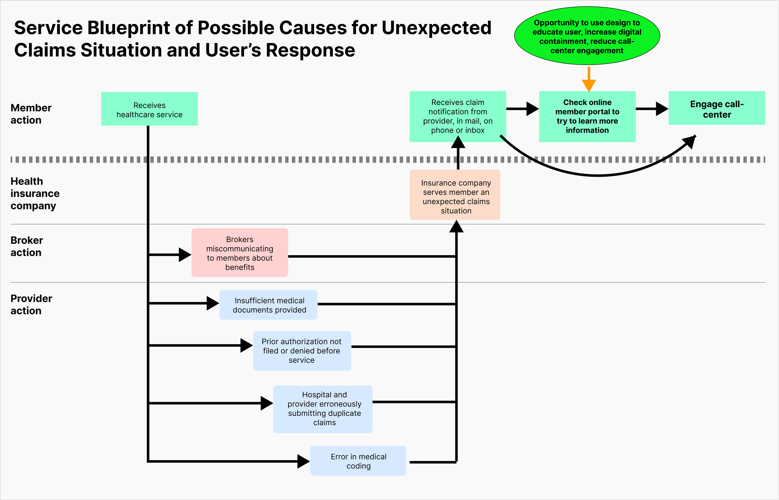
It’s in the business’s financial interest that users are able to self-service on the website and not engage the call-center. Within my sphere of influence, I cannot control the behavior of brokers, healthcare providers, prior authorization filings, or claims adjudication, so my best chance at solving this pain point was educating the users of their situation through their member portal and making them feel confident enough so that they don’t have a need to engage the call-center. In other words, my mission was to increase digital-containment.
The best strategy to win investment for this project was to use a quick usability test and present call-center data to demonstrate a strong ROI for transforming our digital claims communications.
The usability test would use an alternative claims status system and new design to validate my suspicions. After drafting some prototypes and a new claims status system, I wrote an unmoderated test to evaluate a proposed state against the current state.
I assumed the current state was vague because the user couldn’t tell who paid whom and if money was still owed. Therefore, I decided to test a new claims status system that focused around the word “covered”:
Fully covered: The health insurance company has fully covered your healthcare services.
Partially covered: The health insurance company has partially covered your healthcare services, and you may be responsible for a portion of the costs.
Not covered: The health insurance company has not covered your healthcare services, and you may be responsible for the costs.
To go with this new system, I designed a first-draft prototype:
Key differences between the current state and this prototype draft:
1. Definitions are shown immediately underneath industry jargon.
2. Service cost breakdown is shown by default, not hidden under a dropdown
3. Cleaned up page title and member data
My research method was an unmoderated test with 12 users in 2 groups. Group A would see the current state, and Group B would see the proposed state. Each group saw 6 claims scenarios and asked questions about comprehension and next-best-action after each claim.
The results showed confusion surrounding health insurance jargon in the current state, and users showed better comprehension with the proposed status system and page redesign:
“The status of this claim is “Paid”? Only a portion was paid. Why does it say “Paid”? It’s less than not clear. It’s “Partially Paid,” not “Paid”.”
My main insight was that our current system is confusing, and these preliminary designs, though not perfect, were a step in the right direction.
To build my business case and secure funding for this project, I needed to calculate its ROI. I knew that when users were confused about their claims, they tended to reach out to the company. The most common (and expensive) customer touch point was the call-center, so if I could estimate the money saved by reducing costs, and subtract from that the cost of implementation, I could determine the ROI.
I teamed up with a data analyst to look at call-center data. To get a baseline of current costs, we first determined criteria for the types of calls we were targeting to reduce. Then, we took the number of calls-per-year, and multiplied that by average cost-per-call. Our target goal was reducing call volumes by 15% (conservatively), with a stretch goal of 25%. We calculated the number of calls eliminated by the proposed design change, and multiplied that by cost-per-call to get dollars saved per year. Lastly, we took that number and subtracted away the cost of implementation to get the ROI.
I presented a summary of my business case, research, and preliminary prototypes to leadership to secure funding to dive deeper into this pain point.
Part 2: Digging Deeper and Aligning Business Rules
After securing investment from leadership, my next step was to interview claims subject matter experts and content writers to discuss balancing user-centric language with business rules. I learned that just because a service is “covered” doesn’t mean that it’s “paid for”. We also defined back-end logic mappings and exact definitions for each status.
This was the system we arrived at:
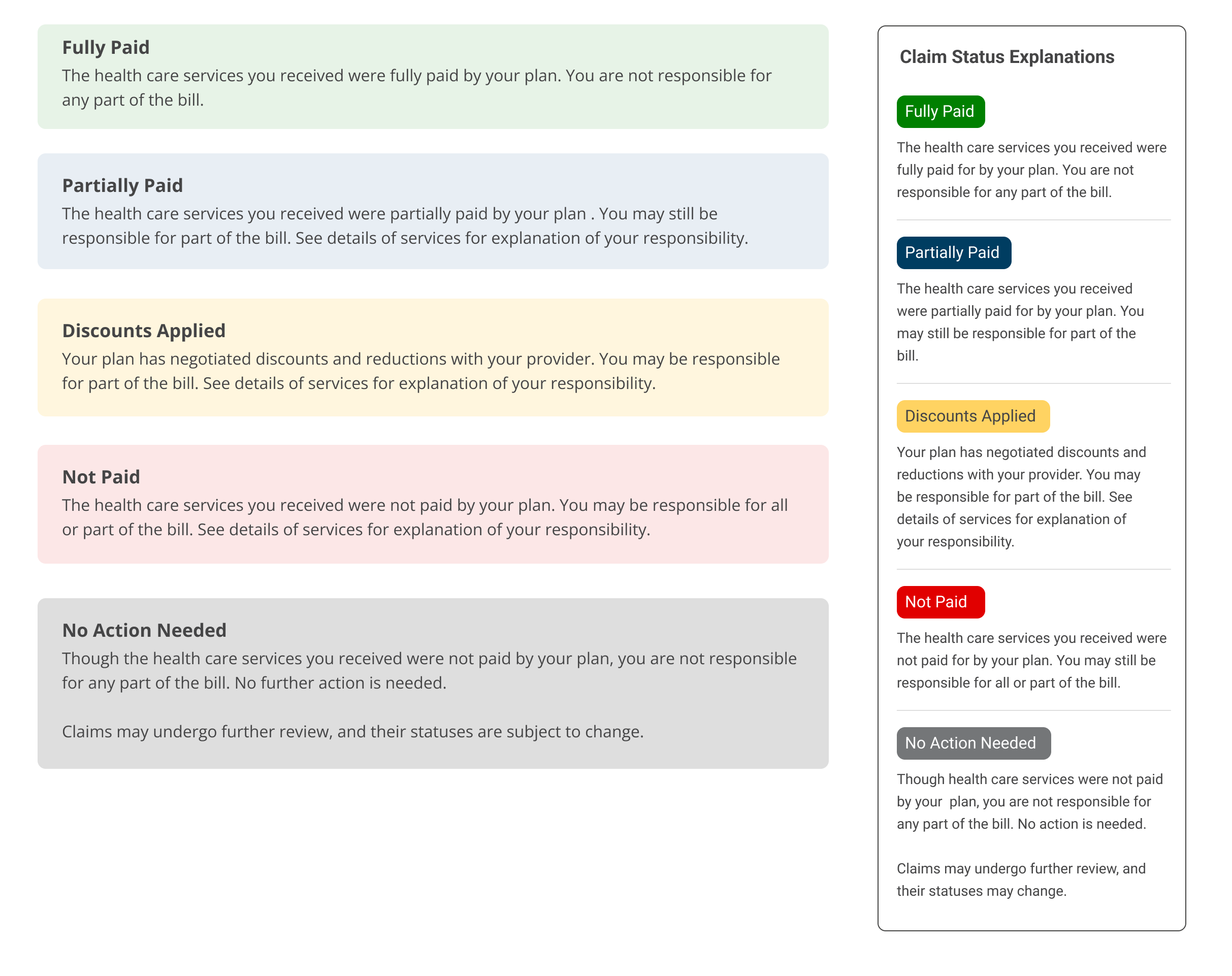
Fully Paid: The health care services you received were fully paid by your plan. You are not responsible for any part of the bill.
Back-end Logic: Patient owes = 0
Partially Paid: The health care services you received were partially paid by your plan. You may still be responsible for part of the bill.
Back-end logic: Patient owes > 0, Discounts and reductions > 0 or Paid by plan > 0
Not paid: The health care services you received were not paid by your plan. You may be responsible for all or part of the bill.
Back-end logic: Patient owes > 0, Discounts and reductions = 0 and Paid by plan = 0
—
I iterated on the designs to achieve a simpler pattern to divide cost responsibilities that would cascade down the page:
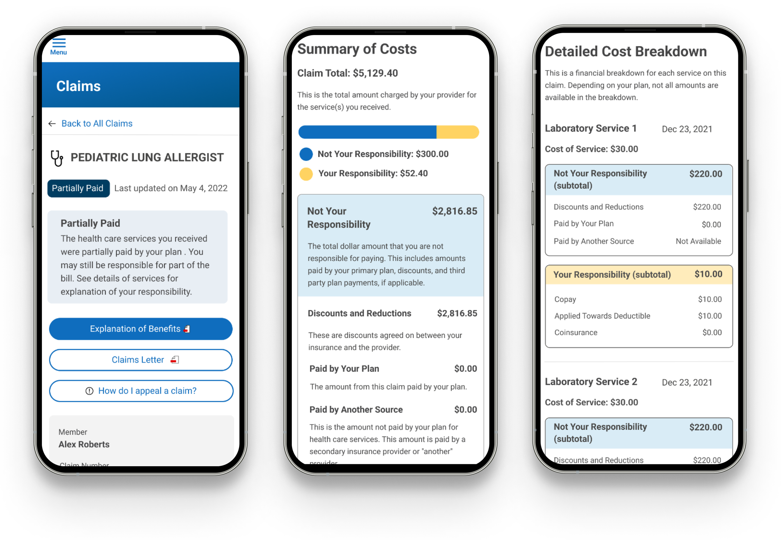
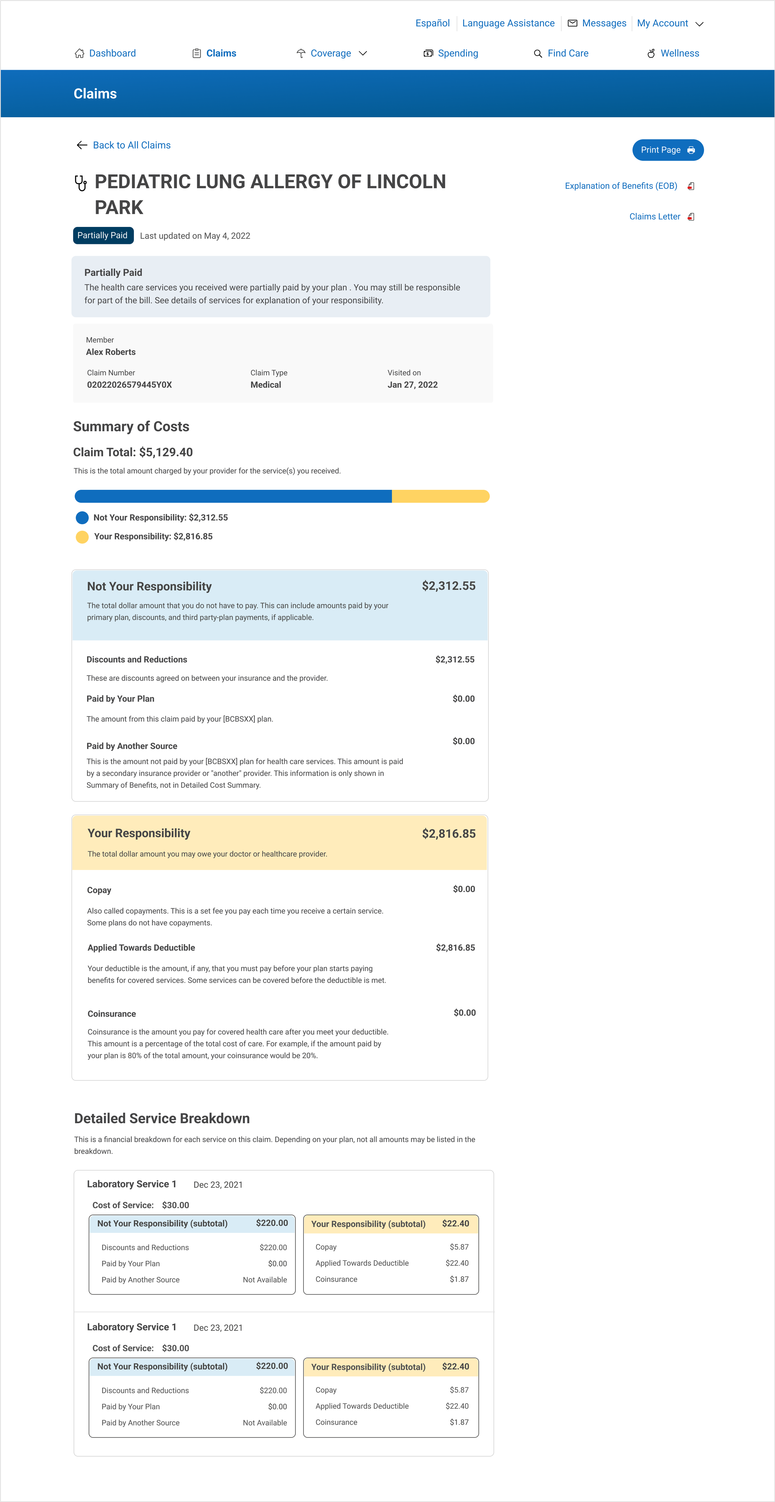
I teamed up with a UX researcher to do a second round of usability testing to put our proposed status system against the existing status system.
“I can easily understand it, but I think if it’s partially paid, it should say “Partially Paid.” That’s probably better than “Processed”, when the plan didn’t cover 100%, which means I need to pay the rest. What’s important is if I need to take any action or not.”
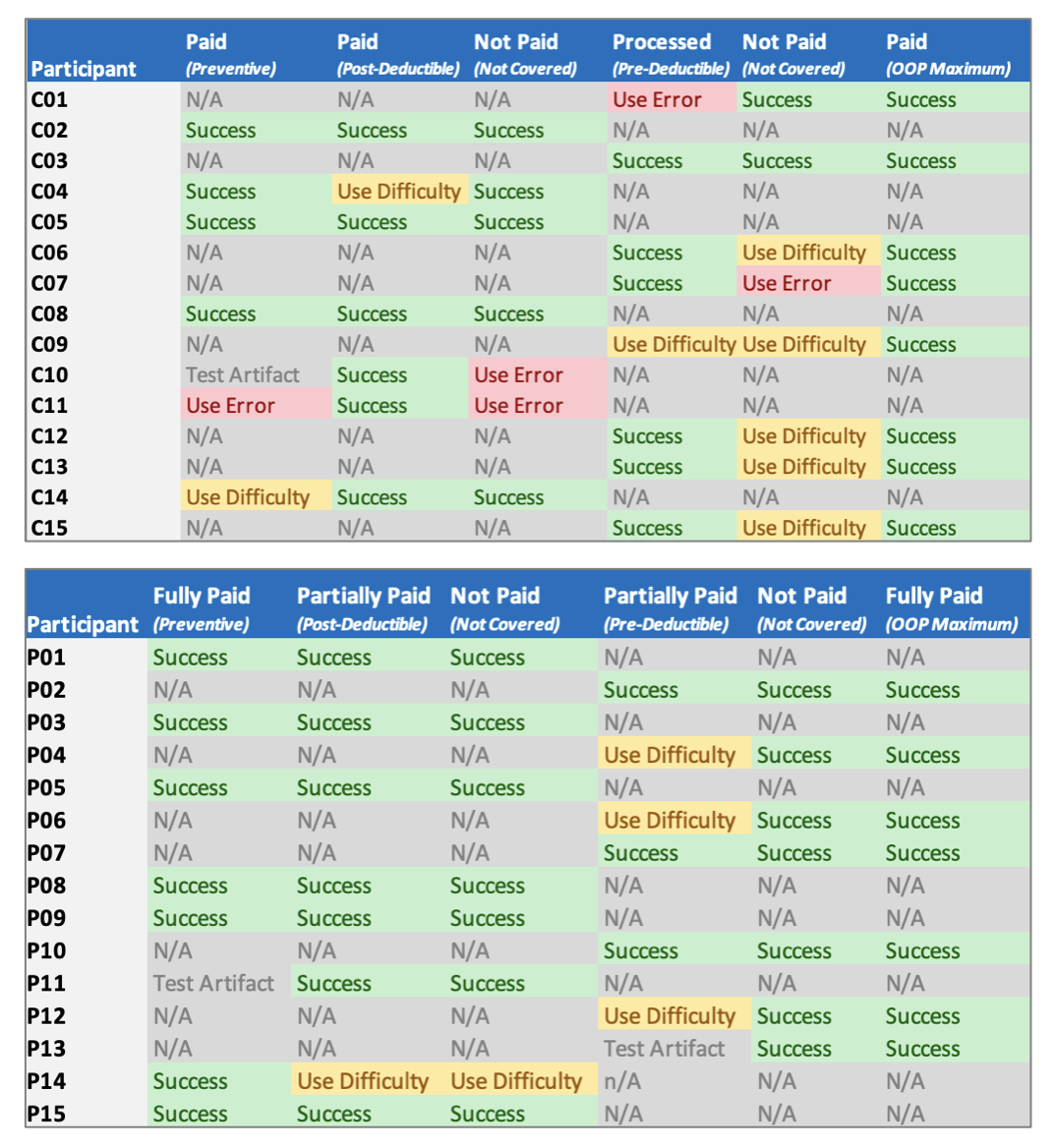
User performance in the current system (top) vs proposed system (bottom).
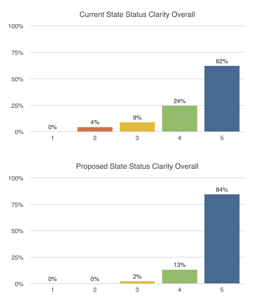
Overall clarity as rated by the user of the current system (top) vs proposed system (bottom).
Goal: Identify whether members more successfully interpret current or proposed claim status and understand potential usability issues or confusion that may occur with each set of claims statuses and their verbiage.
Method: 30 unmoderated users, 15 saw the current system, 15 saw the proposed system. Each user was shown 3 prompts of varying claim scenarios, then asked questions regarding comprehension, clarity, and next-best-action. Then, we asked them to rate clarity of the claims status on scale 1 - 5, with 5 being most clear.
Results: The first table shows comprehension of the current status system, and the second table shows the proposed system. In the current system, we counted 5 instances in participants incorrectly interpreting a status (labeled “Use Error”), and 8 instances of initial difficulty (labeled “Use Difficulty). The proposed system showed 0 instances of Use Error and 5 instances of Use Difficulty.
Insight: Current system is confusing, and we’re moving in the right direction.
In our clarity ratings, the proposed statuses were rated as clearer overall.
Part 3: Rollout Strategy and Accounting for Edge Cases
Our rollout strategy was to first target our smallest Line of Business (LOB). Once deployed, we’d collect call-center key performance indicators (KPIs) for this user group and compare it to pre-deployment metrics. This could also be a time to make small corrections. Once we could demonstrate the positive value of our change, we would deploy to the other LOBs.
I started interviewing stakeholders from the Lines of Business (LOBs), and I discovered two problems with our proposed system:
Problem 1: There’s a difference in situations where there’s a discounted negotiated rate and situations where the insurance company actually pays the claim. Certain members know that insurance companies negotiate with healthcare providers, but not all. Under the previous system, this would be categorized as ‘not paid’, but it would undermine the value proposition of insurance and erode trust between the user and the insurance company.
Problem 2: There’s instances where a claim is rejected due to an error that is already being sorted out on “behind the scenes”. For instance, this could result from a duplicate claim, or missing medical documents. Under the previous system, this would be categorized as ‘not paid’, likely resulting in the user calling the call-center, when really, no action is needed.
To solve for these use cases, I decided to add 2 more statuses to our system:
Discount applied: Your plan has negotiated discounts and reductions with your provider. You may be responsible for part of the bill.
Back-end logic: Patient owes > 0, Discounts and reductions > 0, Paid by plan = 0
No action needed: Though the health care services you received were not paid by your plan, you are not responsible for any part of the bill. No further action is needed. Claims may undergo further review, and their statuses are subject to change.
Back-end logic: Patient owes = 0, Discounts and reductions = 0, Paid by plan = 0
I ran an unmoderated usability test that confirmed the comprehension of these statuses. Our new 5-status system was complete:
Once our partnership with LOB leaders was solidified and they were aligned with our changes, our product team started re-mapping data points between our back-end logic and the databases for each claims source. This process resolved years of tech debt.
Deployment and Epilogue
After going live to our first LOB, we had weekly check-ins with call-center leadership and our analytics team. We saw a 44% reduction in call volumes in our targeted segment, and leadership saw the benefit in investing in user-centered projects that questioned long-standing aspects of our status quo. Additionally, my team made key partnerships to leverage in future user-centered projects across LOBs.
Future considerations include adding more spending-oriented components to this page illustrating the claim’s relationship to other industry terms, such as deductible and out of pocket maximum.
In legacy businesses, not many people question why things are the way they are, and this leads to unchecked inertia and entropy. By implementing a user-centric process to innovate a fundamental high-impact channel of our communications and deliver a high ROI, we made significant headway in focusing the company culture towards user-centric values.