Payment Portal Entry Point
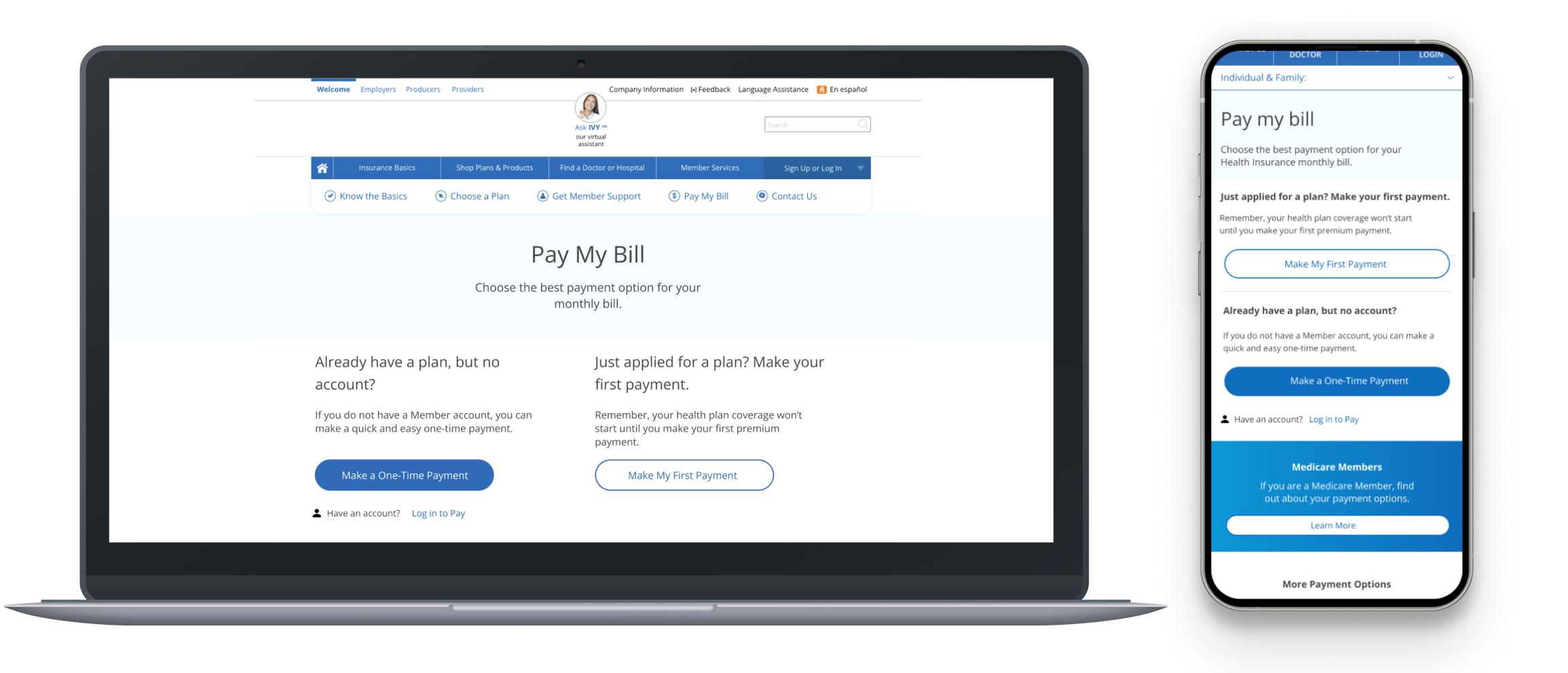
Summary
Collaborated between historically siloed departments at a premiere Health Insurance Company to redesign and ship an entry page for a payment portal to decrease user errors, increase auto-bill-pay signups, and increase digital containment.
Role, Collaboration, and Contribution
UX designer and researcher. Collaborated with engineers, content managers, and delivery owners to deploy the design.
The Brief
The Member Payment Portal (MPP) team saw data indicating that users were accessing the incorrect portal and exiting the site. This resulted in increased calls to customer support. We identified the pain point, discovered the problem, and collaborated across siloed departments to deliver the solution.
Key Outcomes
Our goal was to deploy a web page through which users can select the correct course of action for their situation.
Background and Industry Players
Health insurance company: A health insurance company has disjointed websites and out-dated portals with a lot of confusing jargon that users must navigate. They need a way for members with retail health insurance plans to access the right portal to pay their health insurance premiums. If a member misses a payment, they might have a lapse in coverage, they might call customer service (costs money), and/or leave a bad review (dropping Net Promotor Score).
Users: Retail members are individuals with or without dependents whose health insurance was purchased through the marketplace. They might be self-employed, contractors, or work many part-time jobs. They research, shop, and pay for insurance independently.
Research
It was evident that our work would not only include user research and usability testing, but also implementing the experience through navigating company politics and siloed departments.
This health insurance company is an older firm with siloed departments. There was a lot of separation between the teams that manage the authenticated and public digital spaces. Usually the success of projects depends on breaking down these silos.
This project wasn’t included in the original scope of the Member Payment Portal team, but it was one of the primary entry points for their experience. Once we were made aware of this, we needed to identify the business, technical, and design limitations around this page.
Design and User Research:
We used Decibel to produce a click-rate map of their then-live page (below) and found that:
2nd most clicked link on the page (11% of the clicks) was a navbar link that brought the users back to that page.
3rd most clicked link (7.5%) was a navbar login button (whose function is not primary to this page)
4th and 5th most click links (6.4% and 5.7%) were the page’s secondary functions
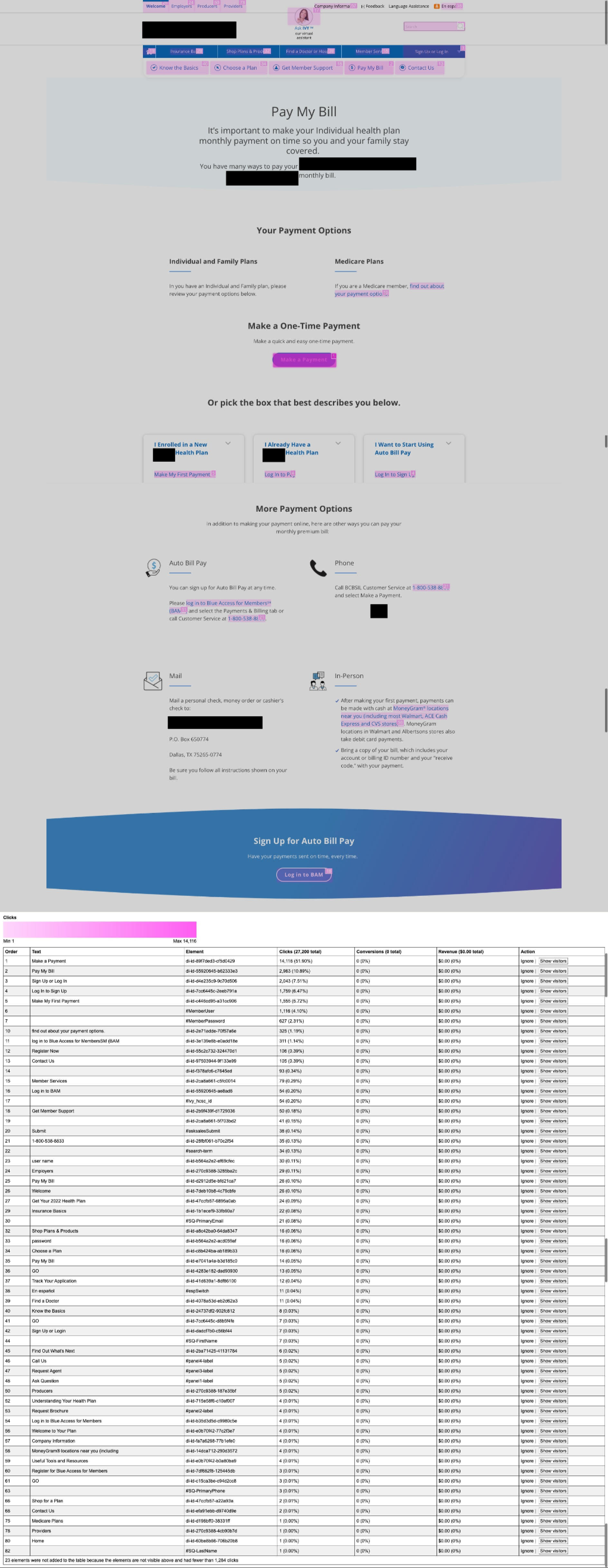
Essentially, 18.5% of user clicks did not serve the functionality of the page. How might we improve this?
Knowing this data prompted more questions:
Does the user know where they are on the site?
Does the user know their situation?
Does the user know what they need to do?
Click-rate maps don’t show you if users make the correct choice for their situation, it just shows you what they did. We needed to do usability test and audit the current experience to achieve a baseline upon which to measure the effectiveness of our redesigns.
Design Principles, Iterations, and Testing
We distilled our research into 3 design principles, which served as the basis of the prototyping process:
Fix common heuristic mistakes (put the CTA above the fold)
Give users clear instructions on when to do what and when (simplify the decision tree)
Simplify design
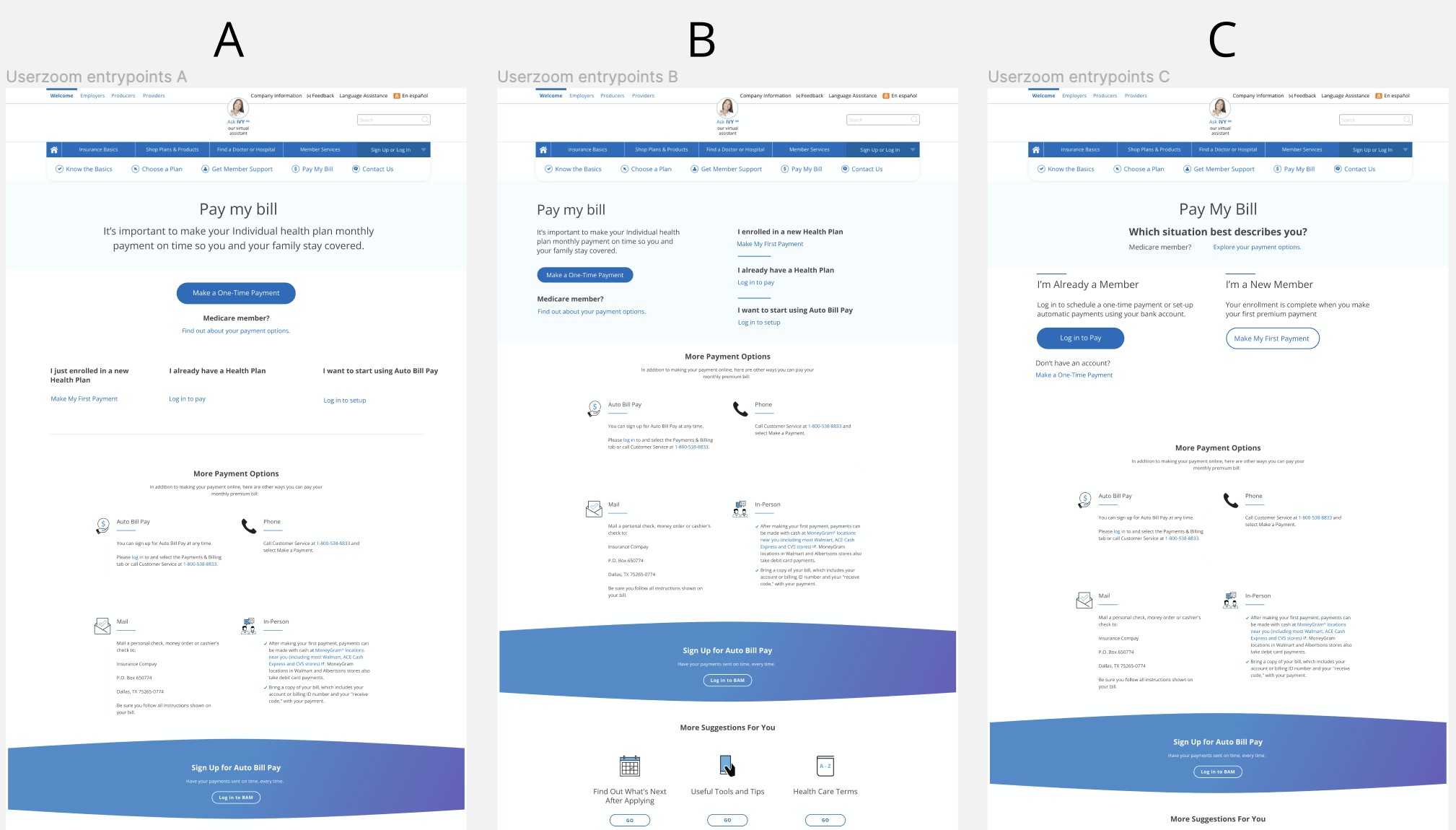
First, we made 3 quick redesigns (1 heavily based on the original) and took them to our design colleagues for a quick preference test. They selected Option B:
We did a Userzoom preference test between the live version and Option B.
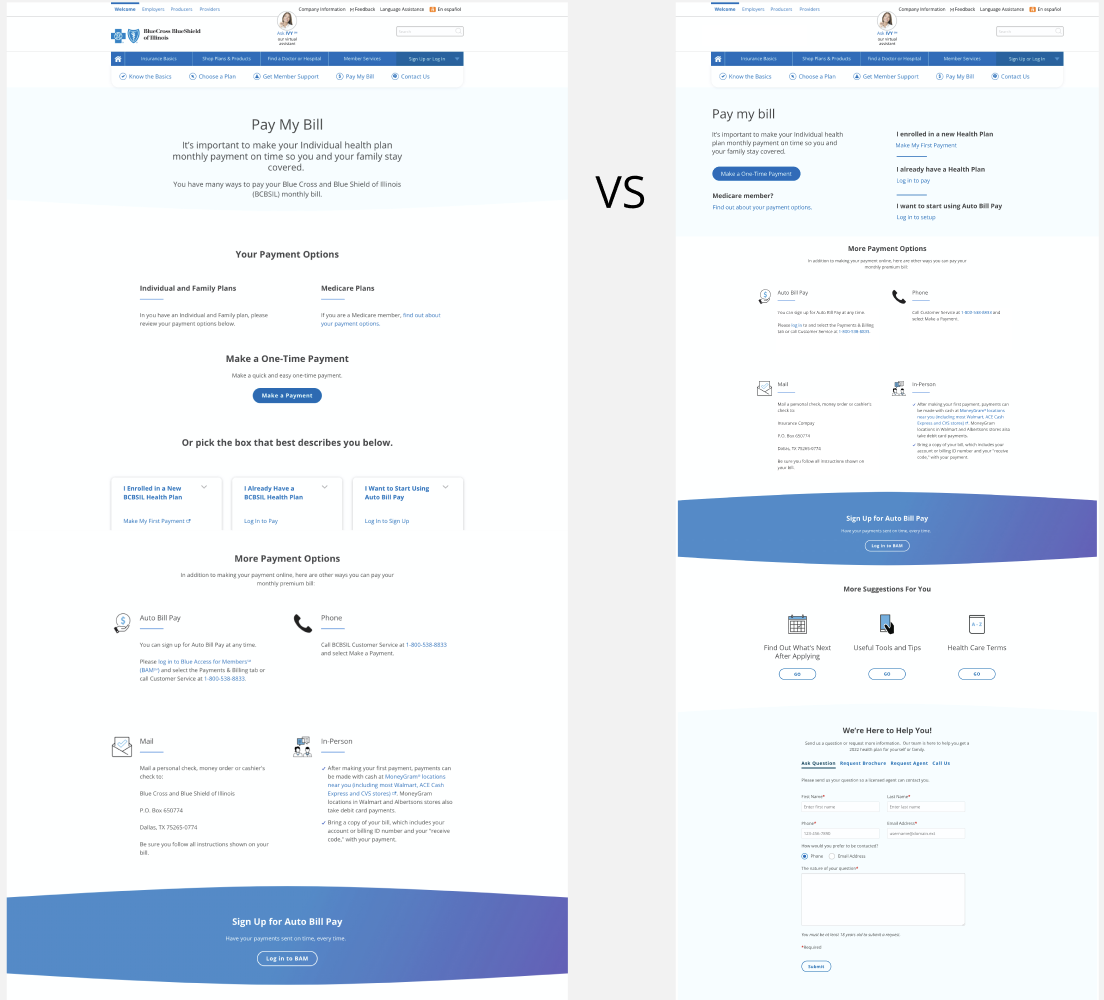
Our unmoderated preference test consisted of asking 6 users (for each design) to complete 4 tasks each.
Here is the main screen. Imagine you recently applied for a health insurance plan and you need to make your first payment. How would you do this?
Now that you’re an existing member, let’s imagine that you need to make a payment for an existing plan, but you don’t have a member login. How would you do this?
Now let’s imagine that you have an account for your existing health insurance plan that you wish to make a payment on. How would you do this?
Now, let’s say you would like to add your payment information to automatically pay for your plan every month. How would you do this?
Here were the results:
Existing design: total task completion: 11/24
Redesign: total task completion: 13/24 - slightly better, not significant
Our test indicated said that neither design worked sufficiently.
The common issues we saw were:
Users weren’t scrolling down enough to view options.
Text descriptions were unclear, resulting in confusion between the two main functions of the page. Users who are supposed to use the “Make My First Payment” button would instead click the main CTA.
Users were confidently wrong.
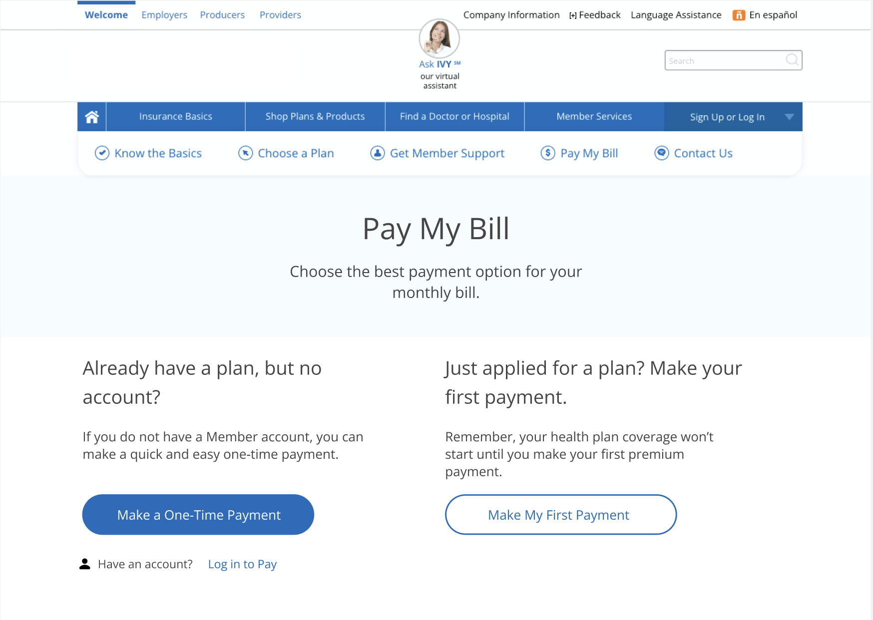
We went back to the drawing board and consulted the data and our business case. We remembered that we wanted users on this page to do 2 main tasks, so we decided to explore the 2-column/2-CTA design (Option C) and rewrite the copy from a 2nd-person perspective.
After another design critique with our colleagues, we created a new prototype with simplified button text (shown below). We ran another Userzoom preference test using the same tasks from the first test:
Here are the results:
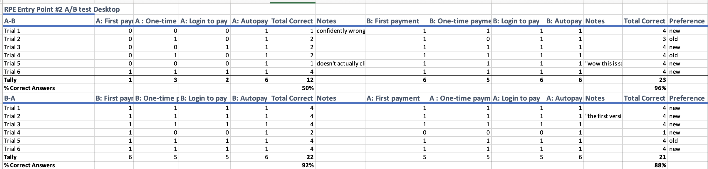
Total task completion jumped from 50% to 92%.
Business and Technical Research:
Since this page was in the public ‘unauthenticated’ section of our website, it was owned by a different division of the company. Engineers and content managers on these pages did not use the same design system or tech stack as the engineers of the authenticated experience (where the Member Payment Portal team operates).
Identifying and getting buy-in from the public site team was going to be a challenge, so we presented our usability study results and business case to the MPP delivery owner, the content lead of the public site, and our design manager. Our business case concluded that using resources to redesign the public site would:
Increasing digital containment, decreasing calls to call-center (saving money)
Increasing Net Promoter Score (main KPI of product leadership)
Promote cross-silo collaboration, moving towards more cohesive company-wide design patterns
By showing that our user journey was only as delightful as its weakest link, we acquired buy-in. Having confusing entry points would only undermine the entire team’s efforts.
Once we identified to stakeholders of the page in question, we collaborated on how to make the design work within the constraints of their resources and tech stacks. This process laid the groundwork for future collaborations with the public site team, and this has resulted in more human-centered design projects to benefit the unauthenticated experience.
Takeaways
Our work as UX designers includes business and technical research as well as usability research. Sometimes, we need to audit the experiences around the ones we’re assigned to deliver a cohesive user flow.
By collaborating effectively across stakeholders in multiple departments, we deployed a redesigned payment portal entry page. Task completion improved by nearly 100% and auto-bill pay registration increased by 24%.